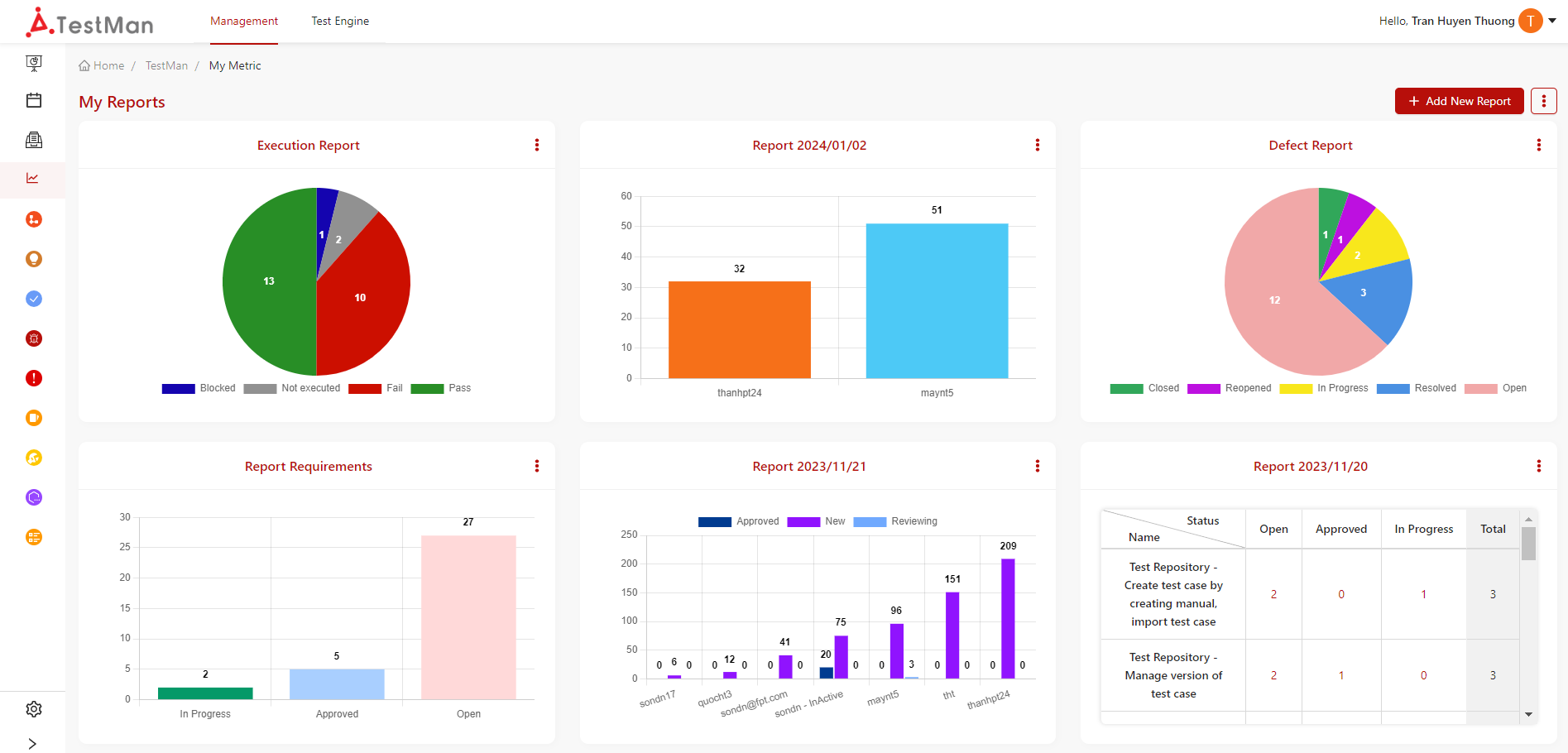
My Metric
This page compiles diverse datasets and generates comprehensive charts, providing visual insights into the underlying relationships within the data. With customizable options for chart types and styling, it offers a user-friendly way to interpret and communicate complex information.
Creating your own chart
-
Go to “My Metric”, clicking on [+ Add New Report] button
-
System will show a popup for selecting Report Chart Type
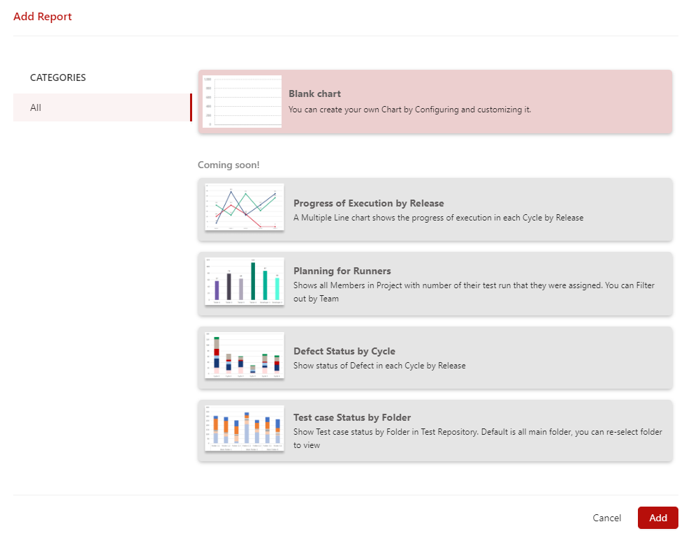
-
-
Select Blank Chart then simply clicking on [Add] button
-
System will navigate to add new report screen

-
-
Select Data Source, Data Source is all tickets in your project
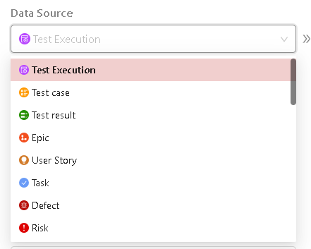
Select Data Source by clicking on text box in Data Source, System will drop down the list of Data Sources, then you can select the Data Source
Note:
- The fields in filter bar depends on the data source that you chosen
- You can filter to narrow data on chart
-
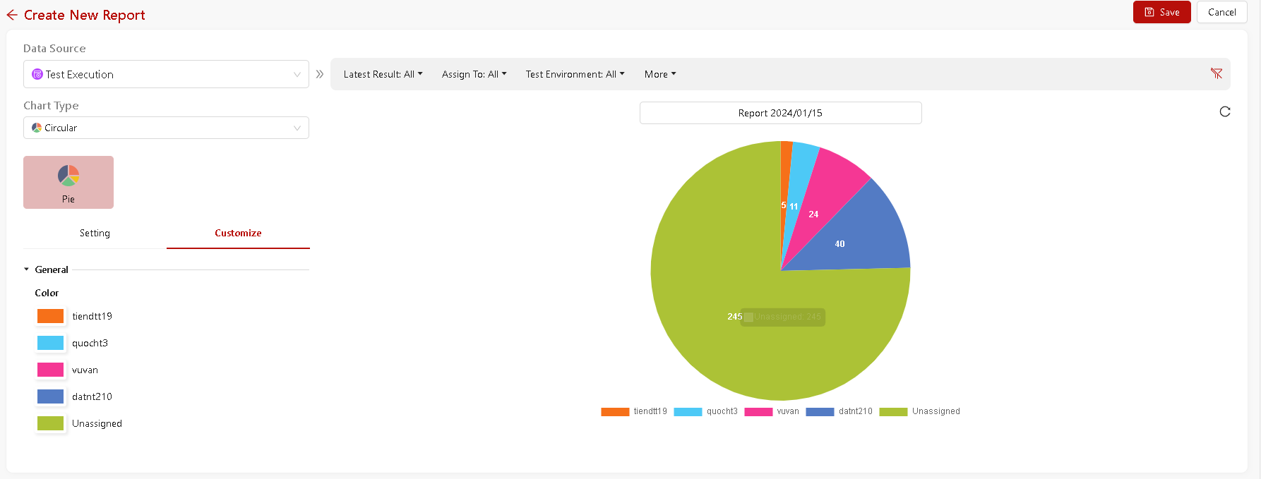
Select Chart Type
In the Chart Type dropdown, select the type for this chart.
Each chart type provides different visualization options for the fields in your data
-
Setting for chart
-
Y Axis: You can apply these accumulates to arrays of Y Axis:
- Count: Count summary of all value in the array for all cases
-
X Axis: Select the field that you want to compile and show in X Axis
- sub X Axis: Select the field child of X Axis
Note:
- Sub X Axis just displaying when you choose chart type is "Column-Grouped" or "Column-Stacked" or "Line-Multiple"
-
Sort by: You can select to sort by X Axis or Y Axis then select sort by ASC (decrease) or DESC (increase) → System will sort data and show in chart
- Show Data table: You can switch on to show data table of chart and switch off to hide
-
-
Customize chart
-
Customize colour strip: Each color box is the color of each label. You can click on each color box → System will show color board then you can choose color for label.
Note: - In case X Axis is chosen as "Status" or "Priority", you cannot customize color
- Title your chart
Click the Enter a title text and give your chart a title. Default name for your chart is Report & Current Date.
- Clicking on [Save] button to add new chart. And the system will add the chart to My Metric board.
Editing your own chart
-
In board list of charts, clicking on [Vertical ellipsis] of each chart
- System will displaying popup has Edit option
-
Clicking on [Edit] to edit chart
- System will navigate to Edit chart screen
-
Editing chart
- Clicking on [Save] button to update new changes
Cloning chart
- In board list of charts, clicking on [Vertical ellipsis] of each chart
- System will displaying popup has Clone option
- Clicking to [Clone]
- System will clone new chart and move to screen add new chart with indexes are same to original chart and chart’s name will be added text “(copy)”
- Editing if necessary
- Clicking on [Save] button to add new chart
Deleting your own chart
- In board list of charts, clicking on [Vertical ellipsis] of each chart
- System will displaying popup has Delete option
- Clicking on [Delete]
- System will show popup warning to confirm your selection
- Simply clicking on [Delete] to confirm