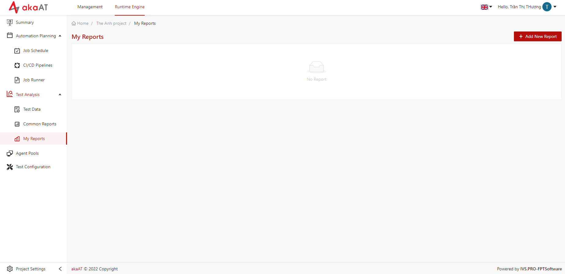
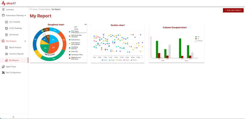
My Report
Creating your own chart
-
Go to “My Report”, clicking on + Add New Report button
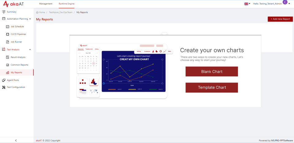
- System will show a popup Create your own charts
Creating Blank chart
-
In popup, clicking on Blank Chart button
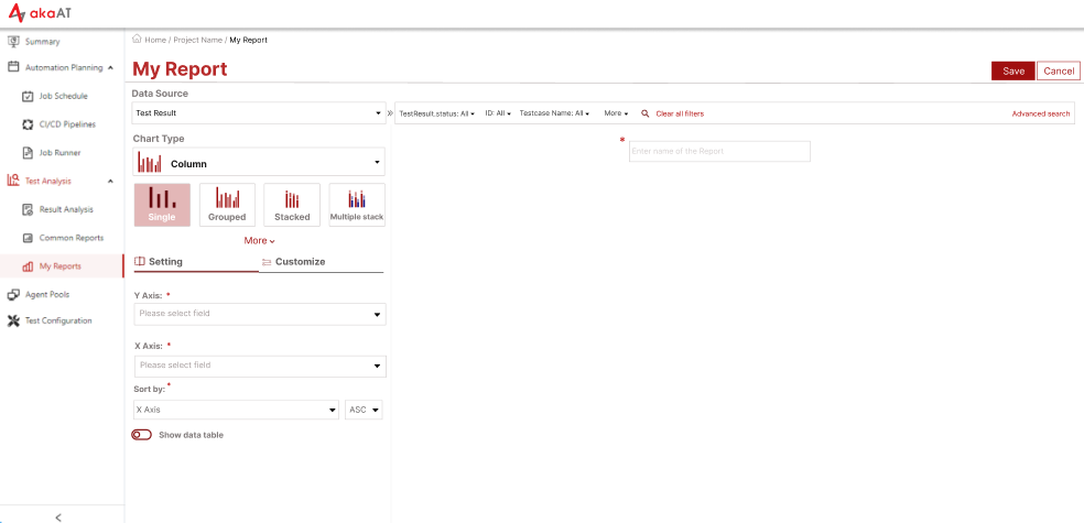
- System will move to config chart screen with default is
- Data Source: Test Result
- Chart Type: Column - Single
- System will move to config chart screen with default is
-
Select Data Source by clicking on text box in Data Source, System will dropdown list of Data Source, then you can select the Data Source.
Note:
- The fields in filter bar depends on the data source that you chosen
- You can filter to narrow data on chart
- Choose chart type → In the Chart Type dropdown, selecting the type for this chart
- Setting for chart
- Y Axis: You can apply these accumulates to arrays of Y Axis:
- Count: Count summary of all value in the array for all cases
- Summary: Returns the summary of all value in the array.
- Average: Returns the average of all value in the array.
- Min: Returns the minimum value in the array.
- Max: Returns the maximum value in the array.
> **Note:** Excepting “Count”, other accumulates will have to select “Field of Y Axis” with numeric format > > > Example: You want to creating chart counting average duration time of all job > > → Select Data Source, then select chart type > > → Select Y Axis is “Average” → then you have to select Filed of Y Axis is “duration” >-
X Axis: Selecting the field that wanting to accumulate and show in X Axis
- sub X Axis: Select the field child of X Axis
- sub-sub X Axis: Select the field child of sub X Axis
Note:
- depending on type of chart that having Sub X Axis And/Or sub-sub X Axis
- Sub X Axis will just dropdown fields that is child of X Axis
- Sub-sub X Axis will just dropdown fields that is child of Sub Axis
- Sort by: You can select to sort by X Axis or Y Axis then select sort by ASC (decrease) or DESC (increase) → System will sort data and show in chart
- Show Data table: You can switch on to show data table of chart and switch off to hide
- Customize for chart
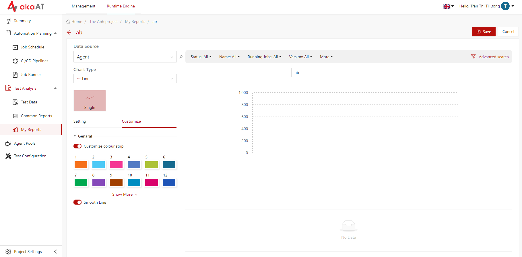
- Customize colour strip: Each color box is the color of each label. You can click to each color box → System will show color board then you can choose color for label.
- Smooth Line:
- Smooth Line will just appear in chart type is “Line”
- Default of shape line is curvy. Switch on to change shape to soft line
- Enter name for chart
- Clicking on [Save] button to add new chart
- System will add new chart to board
Editing your own chart
-
In board list of charts, clicking on [Vertical ellipsis] of each chart
- System will show popup having “edit” function
-
Clicking on Edit button in the top right corner
- System will move to screen having setting and customize chart for you editing
- Editing chart
- Clicking on Save button to update new changes
Cloning chart
-
In board list of charts, clicking on [Vertical ellipsis] of each chart
- System will show popup having “Clone” function
-
Clicking to Clone
- System will clone new chart and move to screen add new chart with indexes are same to original chart and chart’s name will be added text “(copy)”
- Editing if necessary
- Clicking on Save button to add new chart
Deleting your own chart
-
In board list of charts, clicking on [Vertical ellipsis] of each chart
- System will show popup having “Delete” function
-
Clicking on Delete
- System will show popup warning to confirm your selection
- Simply clicking on Delete to confirm